Working on a self-portrait is an illuminating project
I’m learning a lot as I go along. One of them is figuring out how to divorce myself from the picture and paint what I see. It can be an emotional thing to do a self-portrait. You almost never appear in a picture the way you see yourself. I now realize that I picked challenging lighting and a difficult pose. Oh no, nothing straight-forward for me! During this process though, I find I’m making finding some peace with myself.
I’ve gone from age 16 male to 30-something female so I think I’m making headway. I haven’t come up with a good idea for a background yet so I just threw something in there. Uh, take it from me and don’t do that. Especially don’t make it flat black. Sigh. Every time I think I’m “growing up” as an artist I go and do something childish. Focus and paying attention are so important. When you strive for realism you need to paint what you see, not what you think is there. If you have to make it up, have a plan in place. In my experience, “winging it” rarely works in my favor. Not with realism.
Here’s my other painting. I’m still moving forward.
Toning down the entire side of his face made a huge difference. Even with half of his mustache and beard missing it “reads” as being there because the colors are correct.
Many people have probably used this color scheme, but it is most widely know to be used by a Swedish painter named Anders Zorn who was known for his portraits. Here is an example of his work:
Mrs. Walter Rathbone Bacon
I’ve been spending a lot of time in my head trying to figure out how to map out the colors of a Zorn palette, Ivory Black, Titanium White, Vermilion (or Cadmium Red Medium), and Yellow Ochre. There is no blue used on this palette, the black is used as a blue. After a lot of looking around, this was the best paint chart I could find for the Zorn palette. This shows not only the primary colors of this combination but also the secondaries mixed with their complements and tinted white for additional colors. What it doesn’t have are all of the non-tinted colors mixed with varying degrees of black. For this palette, the black only applies to two-thirds of the palette. This was the best representation of available colors I could find that made sense. I found this on Pinterest and the website that it originally came from was not listed.
The colors are fantastic. Using a limited palette like this makes it much easier to figure out how to mix the colors you need. Does it need to be cooler? Add black. Lighter? Add white. Warmer? Decide if it has more red or yellow tint and adjust accordingly.
I expect I will continue to use the Zorn palette for portraits for a while since it is so perfect! I can always add other colors as accents later The great thing about this palette to me is that it limits the amount of “color” you can use and it makes you focus more on your values. I need to say that again for the painters out there…
” The great thing about this palette to me is that it limits the amount of “color” you can use and it makes you focus more on your values. “
If you want to be a good if not great painter, pay attention to your values. Values are everything. More than one famous painter has stated that if you have to get one thing or the other correct, make sure it is value rather than color. Color can’t fix the problem. If the value is correct, the eye will see what it needs to in order to make the painting work.
This task threw me for days. I doubted myself. I doubted that I could do it. I wouldn’t even start for the fear. Isn’t that silly? Now I think it is, but then, well, I guess I just wasn’t thinking. I was feeling and I let it get the better of me for a while.
We had to choose an image to work from in class and to do a self-portrait looking in a mirror. Here’s what I came up with:
I’ll tell you right now, glasses are a bear. I’ll remember that for the future! I don’t know who this gentleman is, I just loved the picture.
It took me a while to find a pose of myself that I was comfortable with. I’ll admit it, I’m vain.
The first step is the drawing, and then stepping away to come back and find any errors that have to be corrected before the drawing is “fixed” to the canvas. There are a couple of ways to do this. The first is to spray the drawing with a fixative such as Krylon Workable Fixatif. I prefer the next method. Rose showed us that you can also fix a drawing by painting over it with thinned paint and wiping some of it off. This leaves your painting tinted with an undertone, which can be very helpful if it is one of the skin tone colors. From there, you can wipe-out highlights (as long as you do it before the paint dries) and that gives you the start of your painting. Here’s an example of that on my self-portrait.
Here is the start of my other painting. Drawing is in place and I’m starting with color. I wasn’t happy with where this was going, so I went in a different direction, putting in a basic background first. That allowed me to better judge my colors. Then I started putting in some of the darks and the whole thing began to make better sense.
My next post will be about the Zorn palette, which is all I’m using to do these portraits. This is a combination of Titanium White, Ivory Black, Yellow Ocre, and Cadmium Red.
Many weeks later… I am so sorry it has been so long. Frankly, my painting class is kicking my butt. I have so much to learn in such a short time and I keep getting in my own way. I have trouble finishing my homework in the time allotted.
Weeks 4 – 6 were spent working on a still life in class and another one at home using only Burnt Sienna and Ultramarine Blue tinted with either Titanium White or Ivory Black. I’m apologizing in advance for my paintings because they aren’t finished. This way you will at least get to see what I have been working on. In time I may finish them. I find, going through this process, that if I have managed to learn what I think I was supposed to get out of that particular exercise, that I’m okay with not finishing it.
These assignments built upon the skills we learned in the drawing class: sight-sizing skills, general drawing skills, and lost and found edges. The primary focus was to help us to develop a better understanding of warm and cool tones; when to use warm or cool shadows and warm or cool highlights. This skill is paramount to developing realistic art.
Warm and cool highlights and shadows are, to advanced color theory, as counting to ten is to imaginary numbers. I’m finally learning the stuff that I knew was holding me back. I’ve learned plenty of other wonderful things about drawing and painting that are important, but this, this I knew I didn’t know.
The other pieces that are making a huge difference for me:
Access to a teacher to answer questions quickly. When I get stuck it is nice to have someone to go to that can help me figure out what I’m doing wrong. With a glance, Rose knows what isn’t working and gives me a list of things to tweak in 5 or 6 seconds. The even better part of this is that if I can’t figure out how to fix it, she will show me how, and why it isn’t working. This is the important piece I can’t always figure out for myself.
Input from other students. We all see things in different ways. When we team up and check each other’s work it allows us to practice the problem-solving skills above. When you see that something isn’t quite right, how can you check to see what it is? We have many different ways of doing that now and it is easier to practice these methods if it isn’t our work we are checking.
The quality of the work in class. I am a strangely competitive animal. There are people in my class that graduated from art school and they are very good. (Those words need to be underlined, bold, and italic.) Having them in class makes me want to work harder at my own work. I need to do better or tackle something more complicated. I’m also watching how other people handle paint. Some use a lot of paint, and others use very little. Some are tight painters (like me most of the time) and some are very loose. There are times when I wish I could spend the entire class watching others paint. I would learn much from that alone!
Other topics we are covering in these classes include such things as mediums, painting surfaces, different types of brushes and bristles, thumbnail sketches and poster studies.
Finally, the painting class portion of the Kipaipai Atelier has begun! I’ve waited months for this and I’m so excited. During the first class, I was bouncing up and down in my chair. Overachiever that I am, about a month ago, I started painting color charts, I read the first three chapters, and I also did some value scales.
For those of you who don’t know, I live in the Big Island of Hawaii in the middle of a large body of water called the Pacific Ocean. I despaired at finding quality in-person art instruction until I found Rose. I’m mostly self-taught with a few workshops thrown in here and there. Having this opportunity is an amazing thing, and I plan to get as much out of it as I possibly can! I also believe that talking about it here will help cement it into my brain and perhaps get you guys to ask question as well!
For our first class, Rose went over a value poster study. This is a basic tool wherein you choose a simple composition and break it down into 4 values. Ivory Black, Titanium White, a light grey and a darker grey. This isn’t something to agonize and spend hours doing. This is meant to be quick, and to make you look and choose, and to see the larger shapes. In the book, Lessons in Classical Painting by Juliette Aristides, Juliette suggests cutting the four values out of cardboard and putting them together. Rose had us paint our value study instead (since this is a painting class).
Four-value study based on Winslow Homer image
Now, I could take hours on this, and I could add many more values to this composition, however, I was only allowed to use 4, and in a limited amount of time. This exercise forced me to do many things: – See the shapes of the values – See the paths as they move through the composition – Understand how to consolidate values into larger masses – By limiting choices, the brain is forced to look for solutions, and that means looking at things more carefully. – By limiting the amount of time to work on this, it forced us to make decisions and just do it.
As part of our homework, we needed to create 7 and 9 step value scales using Titanium White and Ivory Black. Probably because of previous practice, I found the 9-step scale easier to do. Will I ever use a 9-step grey-scale? I don’t know. What I will use is the ability I’m developing to create tints of colors, because painting this scale shows me how saturated with pigment each paint is. That information will prove invaluable as I move forward and start working with color in this class.
7 and 9-step value scales in Ivory Black and Titanium White
I’m not even sure where to start with this, or where I’m going, and I’m not done yet. The simplest version is, I had an idea for a painting. It came into my mind complete, and gorgeous, and I had no idea how to do it. It was outside my realm of experience except for the fact that I’ve used oils, acrylics, paintbrushes, and canvas.
It is a portrait of Scott, with a wildly colorful background, surrounded by these bubbles of inspiration. My first thought was, I can’t do that, I have no idea how! My next thought was that I could figure it out and that this was an important painting to do. For all the times I’ve told the muses, “later,” it was time to act upon it now. That was a couple of weeks ago. The first half of the week I researched how to create cells with acrylic paints. Then my room became a studio in earnest as I began to experiment with what I had learned. Everything is right there in Youtube videos, but not everything is in the same video. I had a blast! I started with small canvases, different color schemes, different thicknesses of paint, different strengths of alcohol, and differing amounts of water. I could have viewed this entire process as a failure because the first few days I worked with this technique, I didn’t get the colors or the results I needed. Finally, I started to get the cells that I wanted to move forward with the larger canvas.
Then, I began building up the colors that I wanted. I discovered how to make different types of cells with alcohol. I was finally on the right path!
This continues to be an eye-opening experience. I don’t know what I’m doing next until I get to that point. I’m figuring it out as I go along. I’m Trusting the Process.
I seem to be enjoying the multiple painting thing. Here’s what I managed so far today:
This is a bit of a challenge because I’m doing it in Acrylics. I wanted to use a glass gel medium that I found a while back, and this will be the perfect opportunity! I’ll post more updates as I work on these.
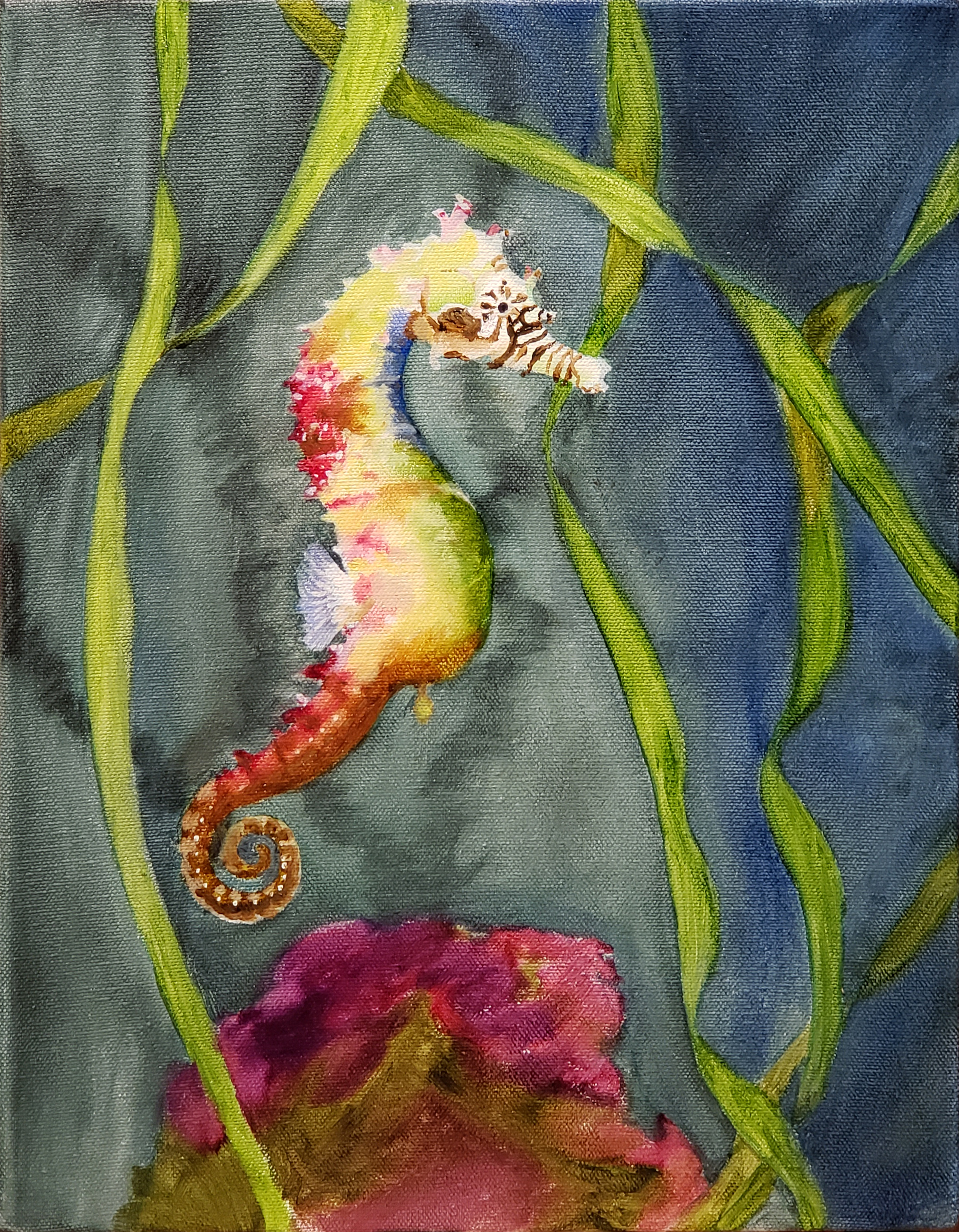
The first three paintings are finished and with the photographer now. Here is the fourth, completely different, and very cute. This is a rainbow seahorse, an endangered species, and I thought it was a great way to finish off the series. I’ll post a picture when it’s finished.
I’m sorry for the delay in posting. I have been focusing on finally getting the website up and running.
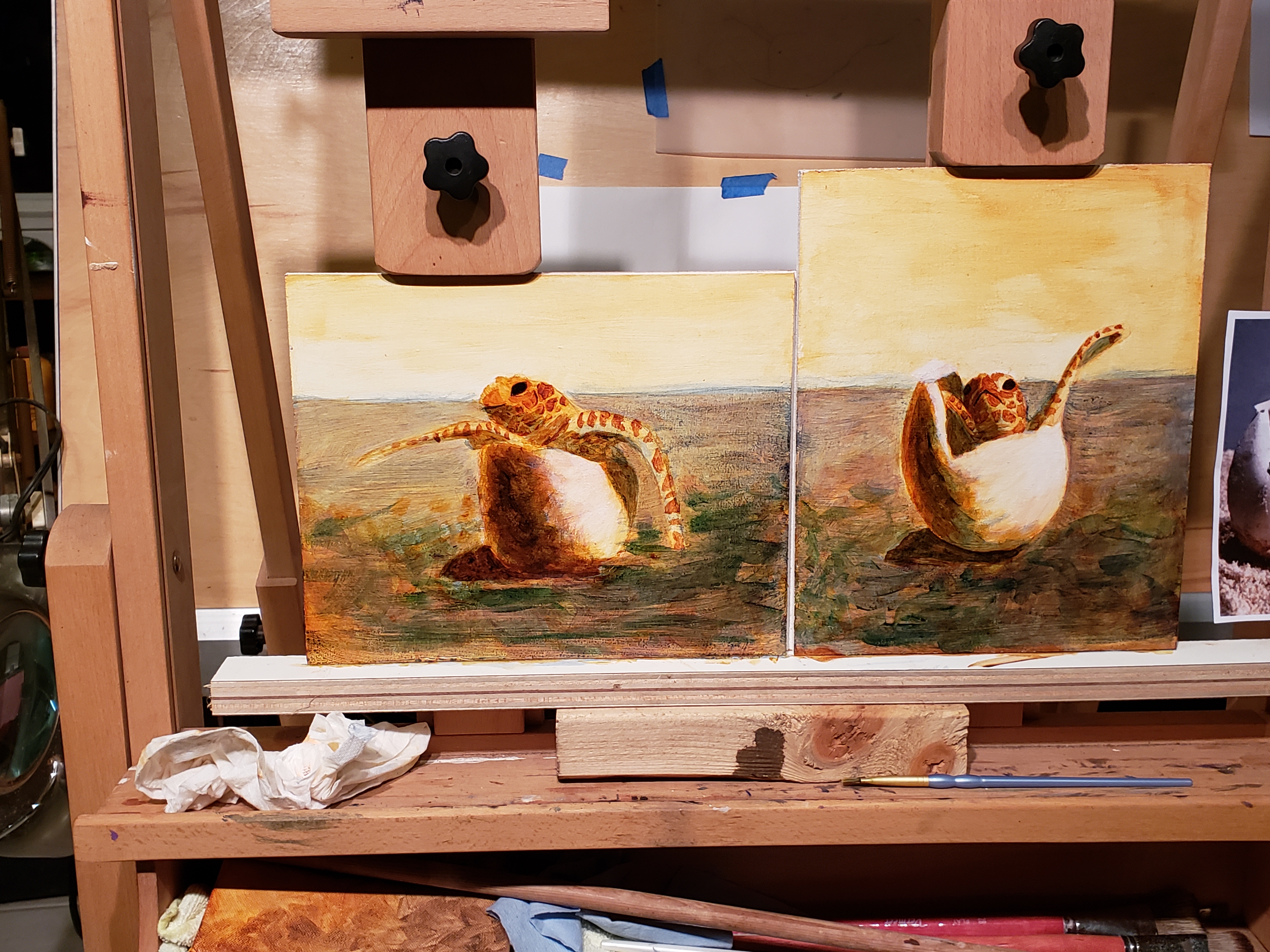
Currently, I am working on a triptych of seahorses. Two paintings I have done at the same time, but three is a new thing for me. This is only the first layer, and my goal is to have each of these paintings stand on their own or as a part of the set. I’m “deep in the uglies” as I like to call it, and I can see glimmers of where this will go when I’m done. The theory is, by working on all three paintings at the same time, I can keep the style the same throughout. If I completed one painting at a time, it is likely that my style or choice of painting methods would change, and end up not working as well together.
I have been working on these at my weekly “paint at the farm” events on Tuesdays. Names for the paintings haven’t come to me yet. They will as the personality develops.
This is my first painting from working under the tutelage of Rose Adare. I have learned so much, and I have so far to go! There is so much I love about this painting. Papa goose looks toward Maui, as though he longs to go home. Mama is keeping an eye on us, protective of her goslings, and the two babies mirror their parent’s poses as children do. The name of the painting came to me long before the mountains appeared in the background. I didn’t know why, but that was the name of this painting, Dreaming of Home.